Design System
From TikTok content to the web — the visual rules, the screens they produced, and the files that build them.
Read in Bahasa Indonesia
- Version
- 1.0
- Source
- DESIGN.md
- Screens
- 16 screenshots
- Contact
- croissantsmoon@gmail.com
01
Summary
This visual system was not invented from scratch. It is translated from material already running on the agency’s TikTok: the “Types of Gen Z Workers” carousel, the “cara ngonten & branding” moodboard, and the ten talent profile cards from the “meet our trover” series. The job of this document is to make sure the site feels like the same account, not like a generic agency site that happens to carry the same logo.
Each section below shows three things in order: the rule from DESIGN.md, a screenshot of the finished screen, and the files that implement it.
02
Brand Personality
Bold, blunt, editorial, slightly confrontational. The system reads like a streetwear magazine crossed with a hot-take thread: oversized type doing the talking, minimal decoration, and one accent colour carrying the entire emotional load.
Two registers coexist and both have to feel native to the same brand — the agency/culture voice, punchy and meme-adjacent, for opinion content and the About page; and the talent/editorial voice, clean and high-fashion, for the roster and profiles.
03
Colour Palette
Three colours, no more. This rule is what makes dozens of TikTok posts read as one system, and the same rule applies on the web.
- Primary background #FFFFFF
Dominant across almost every page - Secondary background #000000
Section breaks and full-black CTAs - Accent red #EA1B23
Wordmark, one word inside a headline, callout labels
Implementation Tailwind’s default palette is replaced outright in tailwind.config.ts, leaving only black, white and brand-red. Writing text-red-500 or bg-gray-100 fails at compile time — the rule is enforced by the build, not by review.
04
Typography
Headlines are deliberately oversized relative to the viewport: type is a graphic element, not merely a label. That is why the scale is fluid with clamp() rather than fixed steps. Emphasis comes from turning one word red inside a headline, never from adding a size or a colour.
| Token | Size | Used for |
|---|---|---|
| wordmark | clamp(4rem, 19vw, 15rem) | Talent name on a profile page |
| display-xl | clamp(2.75rem, 10.5vw, 9.5rem) | Home hero headline |
| display-lg | clamp(2.25rem, 7vw, 6rem) | Large section headlines |
| display-md | clamp(1.75rem, 4.5vw, 3.5rem) | Section titles |
| display-sm | clamp(1.375rem, 2.6vw, 2rem) | Sub-titles and callout statements |
| eyebrow | clamp(0.75rem, 1vw, 0.875rem) | Small uppercase labels, wide tracking |
| lead | clamp(1.0625rem, 1.5vw, 1.3125rem) | Opening paragraphs |
Note The original display typeface has not been identified (DESIGN.md §10.2). This build uses Archivo with its width axis for the logotype, and Figtree for talent wordmarks and body copy. Both are self-hosted through next/font, with no request to a third-party origin.
05
Layout Patterns
The eleven patterns below cover the whole site. Each one shows its rule, the screen it produced, and the files that build it.
§3 · §4.3 — Hero
Two-tone headline
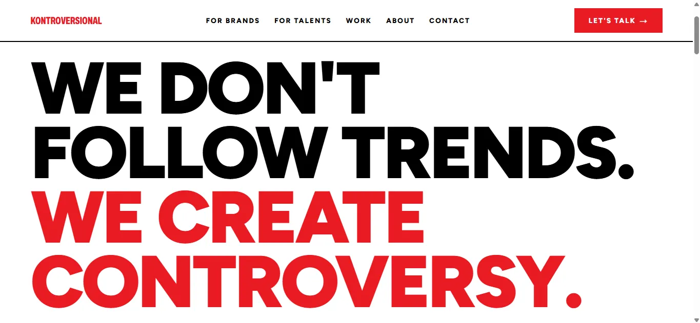
Design The oversized headline is broken across short lines with tight leading, then a full sentence switches to red as the punchline. No photography, no decoration — type carries the entire screen.
Implementation TwoToneHeadline takes the text in segments and marks which one is accented, so the colour split is never hand-written per page. Sizing uses the display-xl token.
- components/ui/TwoToneHeadline.tsx
- components/sections/HomeHero.tsx
Existing site pattern
Stats bar & tagline marquee
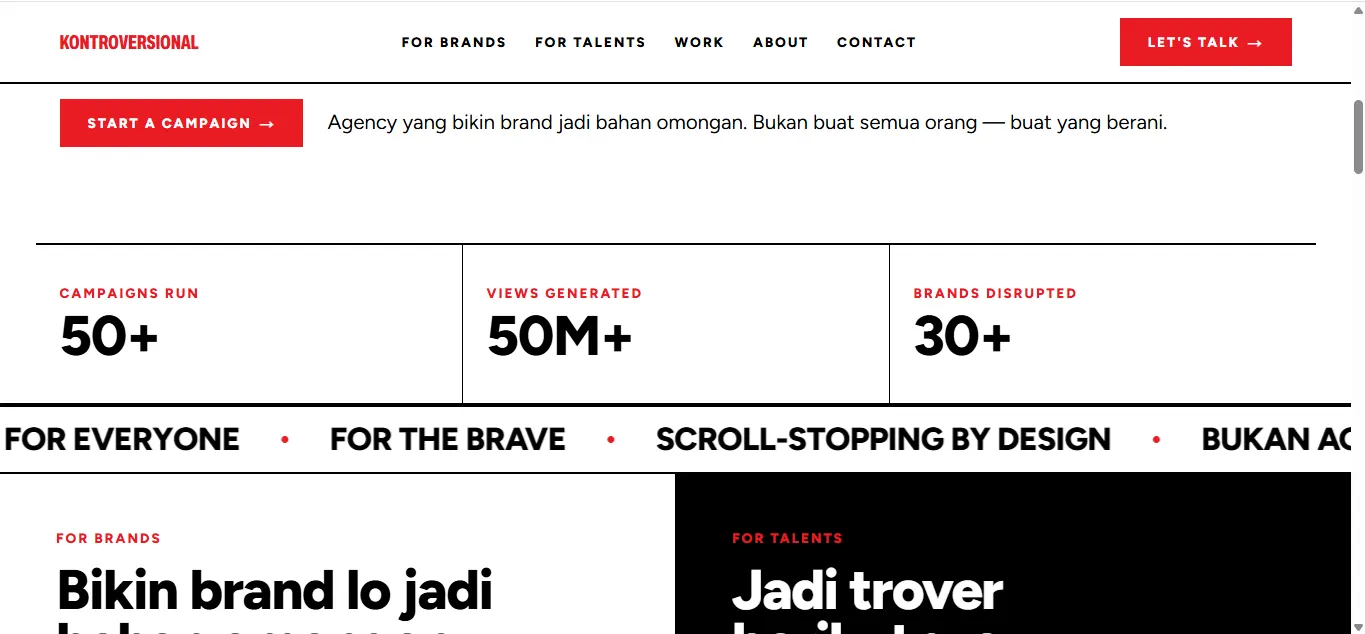
Design Three proof numbers separated by thin vertical rules, then a horizontally scrolling tagline strip as a rhythmic break before the next section — a pattern the current site already uses, carried forward.
Implementation MarqueeTicker duplicates its contents and animates a -50% translate linearly and endlessly, with duration set through a CSS custom property. It pauses on hover and stops entirely under prefers-reduced-motion.
- components/ui/MarqueeTicker.tsx
- app/globals.css
PRD §6.1 — Audience fork
The two-audience split
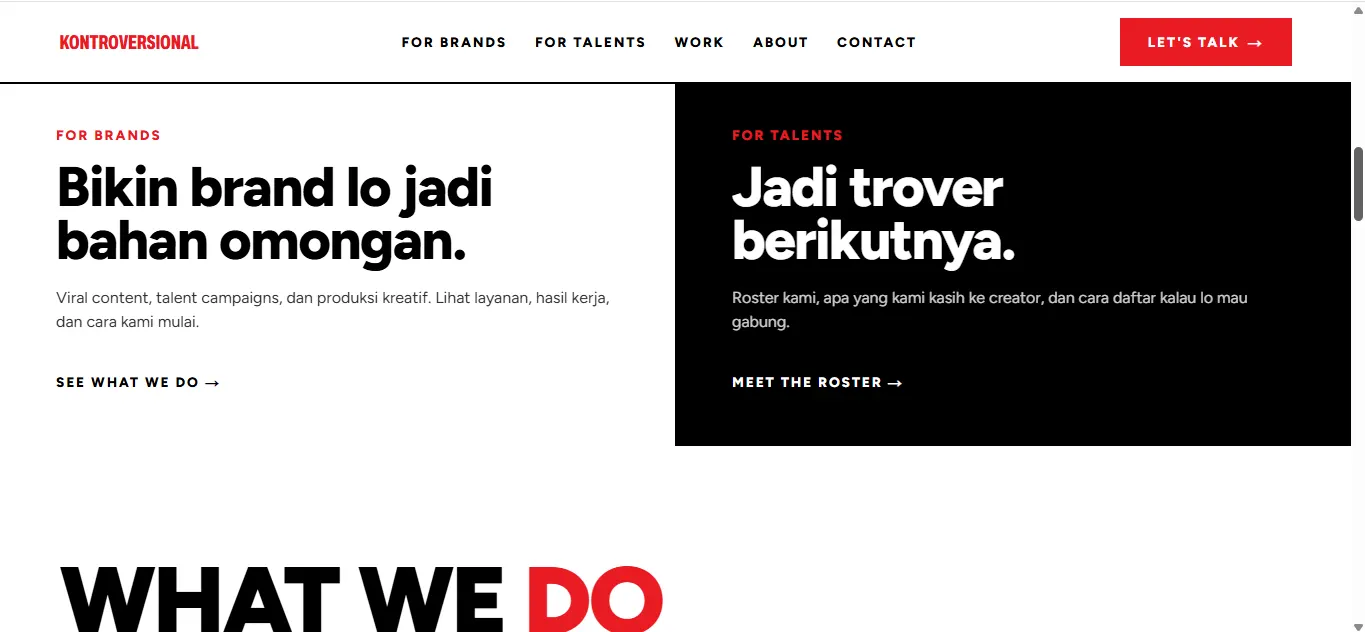
Design The audience fork is built as two large clickable panels, not as navigation items. White against black separates them without introducing a single new colour.
Implementation One two-column grid that stacks on mobile. The dark panel switches its text components to their onDark variant, so contrast still clears AA without any new colour value.
- components/sections/AudienceFork.tsx
§4.3 — Numbered content
Numbered services grid
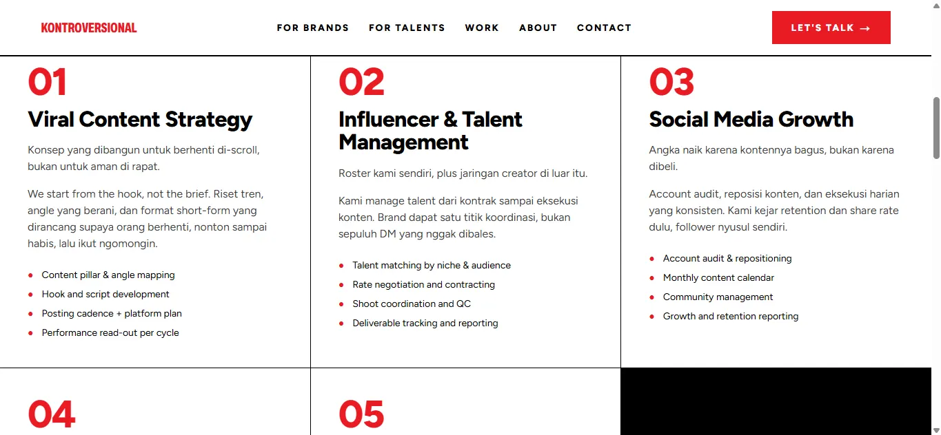
Design The numbered-slide pattern from the TikTok carousel moves across unchanged: a large red number, a bold title, a paragraph, then a bulleted list. Cells are separated by thin black rules, not by cards with shadows.
Implementation The five services are read from content/services.json and validated at build time, so adding one means editing a single JSON file. One cell is deliberately left black to break the regularity of the grid.
- components/sections/ServicesGrid.tsx
- content/services.json
§4.5 · §4.3
CompareGrid & Kontroversial Take
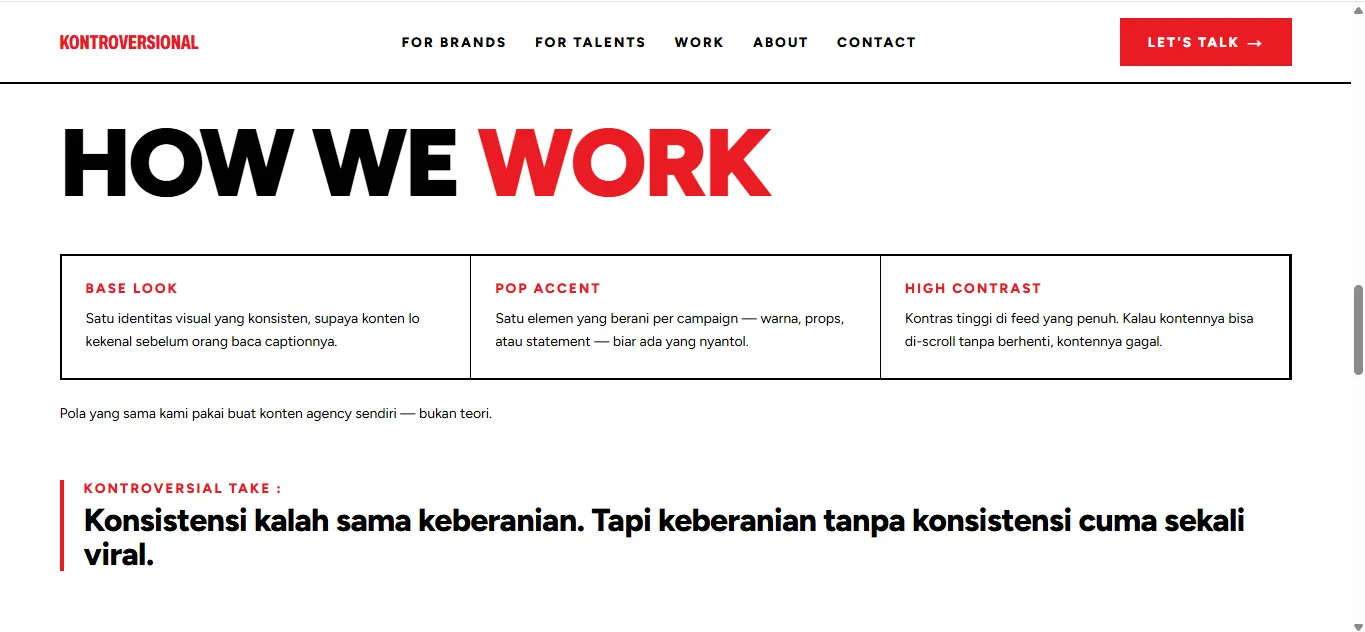
Design The three-column moodboard from the “cara ngonten & branding” post becomes a comparison component, closed out by the brand’s signature rhetorical move: a red “Kontroversial Take :” label followed by one opinionated line.
Implementation TakeCallout accepts a single statement line, not a paragraph — the API constraint deliberately forces a firm claim rather than a hedge. An onDark variant exists for use inside black sections.
- components/ui/CompareGrid.tsx
- components/ui/TakeCallout.tsx
§4.1 — Talent card
Portrait + name lockup
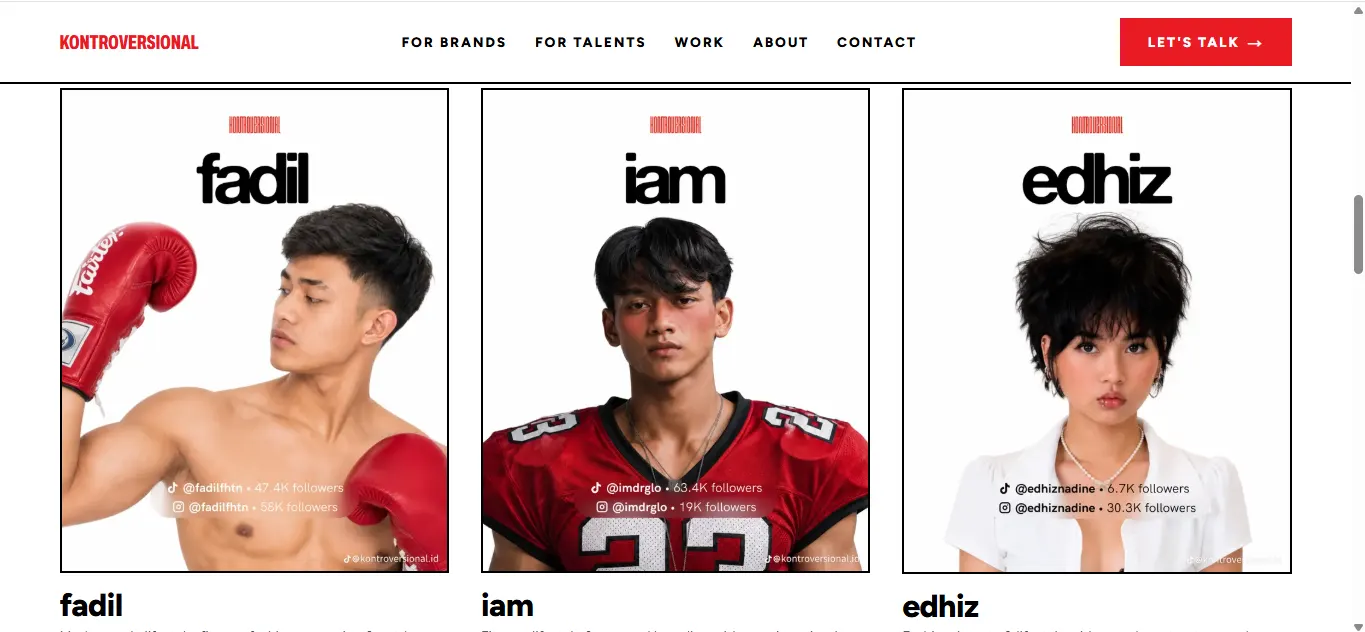
Design Lowercase name wordmark, cutout portrait on white, then handles and follower counts on a translucent pill at the bottom. Cards have no rounded corners and no shadows — only black rules.
Implementation The supplied assets are finished social cards: logo, wordmark and pill are baked into the pixels. TalentPortrait crops them using fractions of the source so the elements rebuilt as real HTML do not appear twice, and the crop stays correct at every srcset width.
- components/ui/TalentPortrait.tsx
- components/ui/StatBadge.tsx
- components/sections/TalentGrid.tsx
§4.2 — Bio spread
Meet our trover
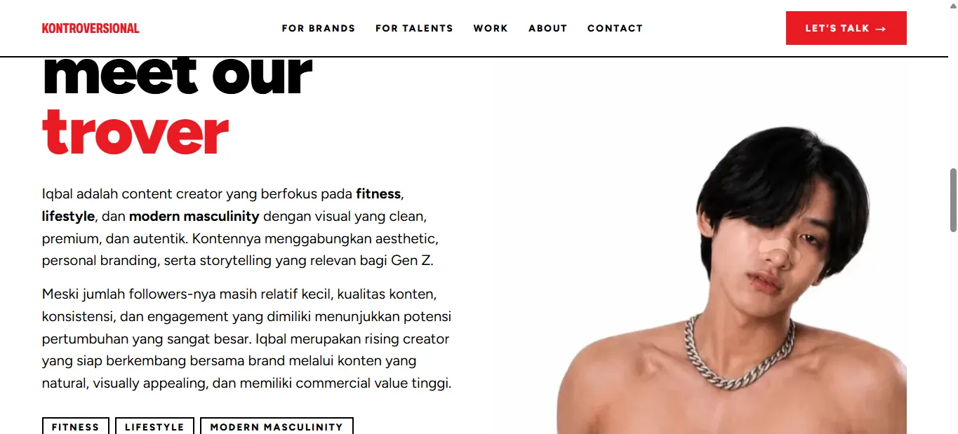
Design A two-column layout; the portrait is never centred. A stacked heading with “trover” in red, a bio with two to four niche phrases bolded, and those same niches lifted out as chips.
Implementation TalentBio reads the bio and niche list from the talent JSON file and renders both: bold inside the paragraph and as separate chips. Bios stay in Indonesian to match the brand voice — the code-switching is not forced into translation.
- components/ui/TalentBio.tsx
- components/ui/TalentHero.tsx
- content/talents/*.json
§4.4 — Full-black
Section break & CTA
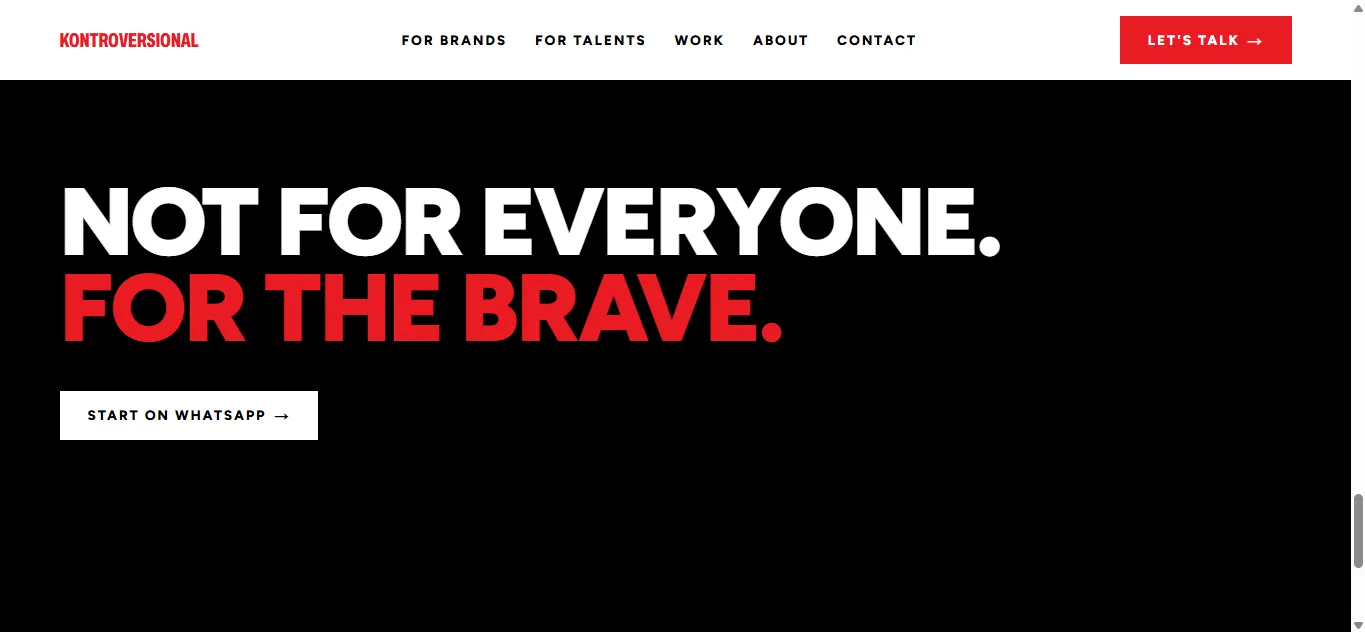
Design The black slide works as a palate cleanser between photo-heavy sections, and as the final stage before the CTA. No photography here — just type and one button.
Implementation SectionBreakBlack wraps the content and switches its children to their onDark variant. WhatsApp remains the primary conversion route, matching how the current site actually behaves.
- components/ui/SectionBreakBlack.tsx
- components/layout/WhatsAppCTA.tsx
PRD §6.2 — Portfolio
Case studies & logo wall
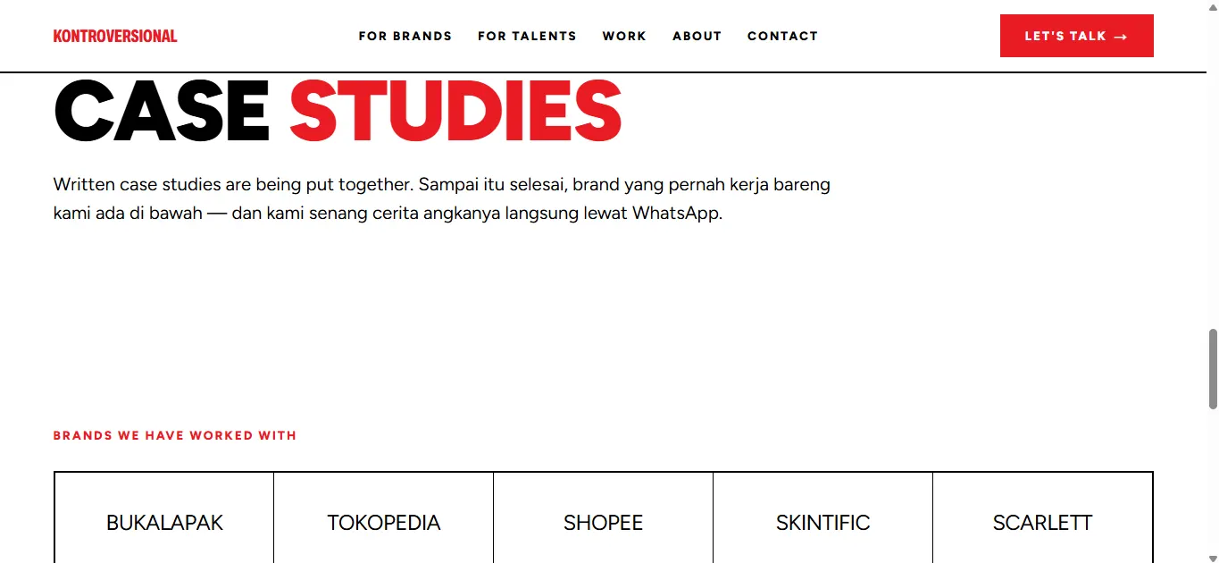
Design Clients without a written case study appear as a logo only, not as a fake card inventing metrics. That honesty is part of the brand voice, not a compromise.
Implementation clients.json may point at a caseStudySlug; the content loader cross-checks every slug against the case study files that exist and fails the build on a typo, so no dead link ever ships.
- components/sections/ClientLogos.tsx
- lib/content.ts
- content/clients.json
PRD §6.5 — About
Why Us pillars
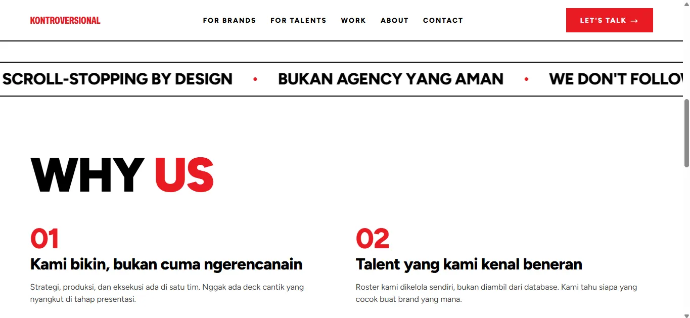
Design The four pillars from the current site are carried forward and restyled, using the same numbered pattern as the services grid so the system stays consistent across pages.
Implementation The same numbered-card component is reused — a pattern that appears on three different pages is written once.
- components/ui/NumberedInsightCard.tsx
- app/about/page.tsx
PRD §6.5 · ARCHITECTURE §7
Contact
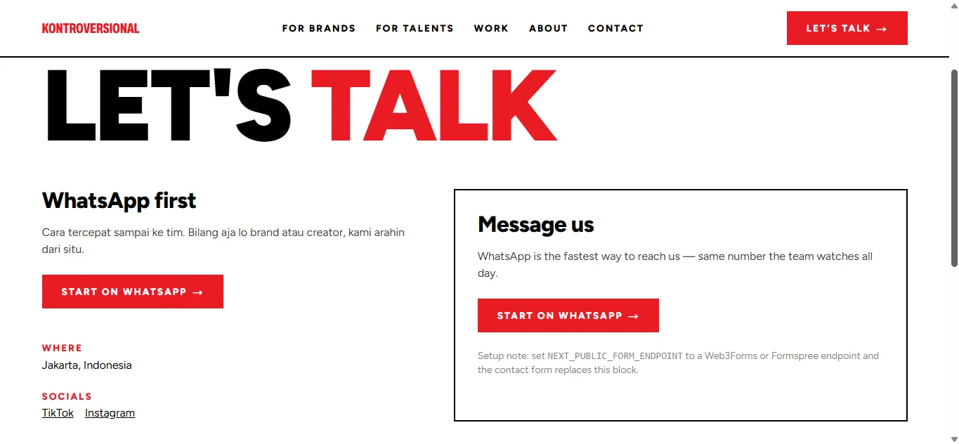
Design WhatsApp is placed as the first route rather than an alternative, because that is the behaviour already proven on the current site. The form follows as the second route.
Implementation The form only renders when NEXT_PUBLIC_FORM_ENDPOINT holds a Web3Forms or Formspree endpoint. Without it the panel shows the WhatsApp block plus a setup note, so the site never displays a form that posts nowhere.
- components/sections/ContactForm.tsx
- .env.example
06
Reusable Components
Every pattern above is built from the list below. The last column points at the section of DESIGN.md that produced it.
| Component | Role | Source |
|---|---|---|
| TwoToneHeadline | Headline with one word in accent red | §3, §4.1, §4.2 |
| TalentHero | Full-bleed portrait, name wordmark, logo, stats pill | §4.1 |
| TalentBio | Two-column bio with bolded niche keywords + tag chips | §4.2 |
| TakeCallout | Red “Kontroversial Take :” eyebrow + one firm line | §4.3 |
| NumberedInsightCard | Photo + number + title + body + TakeCallout | §4.3 |
| SectionBreakBlack | Full-black, text-only section divider | §4.4 |
| CompareGrid | Three-column grid + explanatory block beneath | §4.5 |
| StatBadge | Platform icon + handle + follower count, translucent pill | §4.1 |
| MarqueeTicker | Horizontally scrolling tagline strip | Existing site pattern |
| TalentPortrait | Responsive image + crop against the source social card | §4.1, §5 |
| Reveal | Short reveal as an element enters the viewport | §7 |
07
Motion & Interaction
Motion here is fast and short, echoing a carousel slide change rather than the cinematic parallax that makes agency sites sound alike. Reveals run 380ms with a small vertical shift, once, as the element enters the viewport.
Implementation Reveal uses IntersectionObserver and only flips one data attribute; the actual transition lives in CSS. The marquee pauses on hover. Every animation is switched off under prefers-reduced-motion, including scroll-behavior.
08
Accessibility
- Red is used for large text or short uppercase labels; at body size its contrast is checked before merge.
- The red focus ring with offset stays visible on both white and black backgrounds.
- Every image carries descriptive alt text — talent portraits describe context rather than repeating the name.
- The mobile menu uses the native <details> element: correct disclosure semantics with no JavaScript.
- A skip link to the main content is present on every page.
09
Do / Don’t
Do
- Keep every screen to black + white + one red.
- Let type be the dominant graphic element — large, confident, occasionally breaking the grid.
- Use full-bleed cutout photography rather than framed images.
- Reuse “Kontroversial Take :” as the brand’s signature moment.
Don’t
- Introduce a second accent colour, gradients or pastel tones.
- Use thin display type for headlines — this brand voice is heavy and blunt.
- Centre-align long body copy.
- Let talent pages drift into the generic influencer template: rounded cards, soft shadows, pastel gradients.
10
Open Items for Handoff
- Sample the exact red hex from the source logo files — #EA1B23 is still an approximation from DESIGN.md §2.
- Identify or license the real display typeface used in the talent wordmarks. This build uses Archivo for the logotype and Figtree for wordmarks and body as the closest match.
- Supply high-resolution talent portraits. The current assets are finished social cards, which is why the logo, wordmark and stats pill have to be cropped away by TalentPortrait.
- Decide whether the black-and-white culture photography is reused as-is or re-art-directed for the web.
11
Contact
Questions about this design system, its assets, or the implementation:
croissantsmoon@gmail.comSave this document as a PDF from your browser’s print dialog.